An Atomic Design System
The transformation of HCF
At HCF we were tasked to work on a major transformation, as a part of this project an integral piece was establishing a new design system from scratch.
My Role: UX, UI
Project Type: Design System
Tools: Figma, Miro, Jira, Confluence, More+
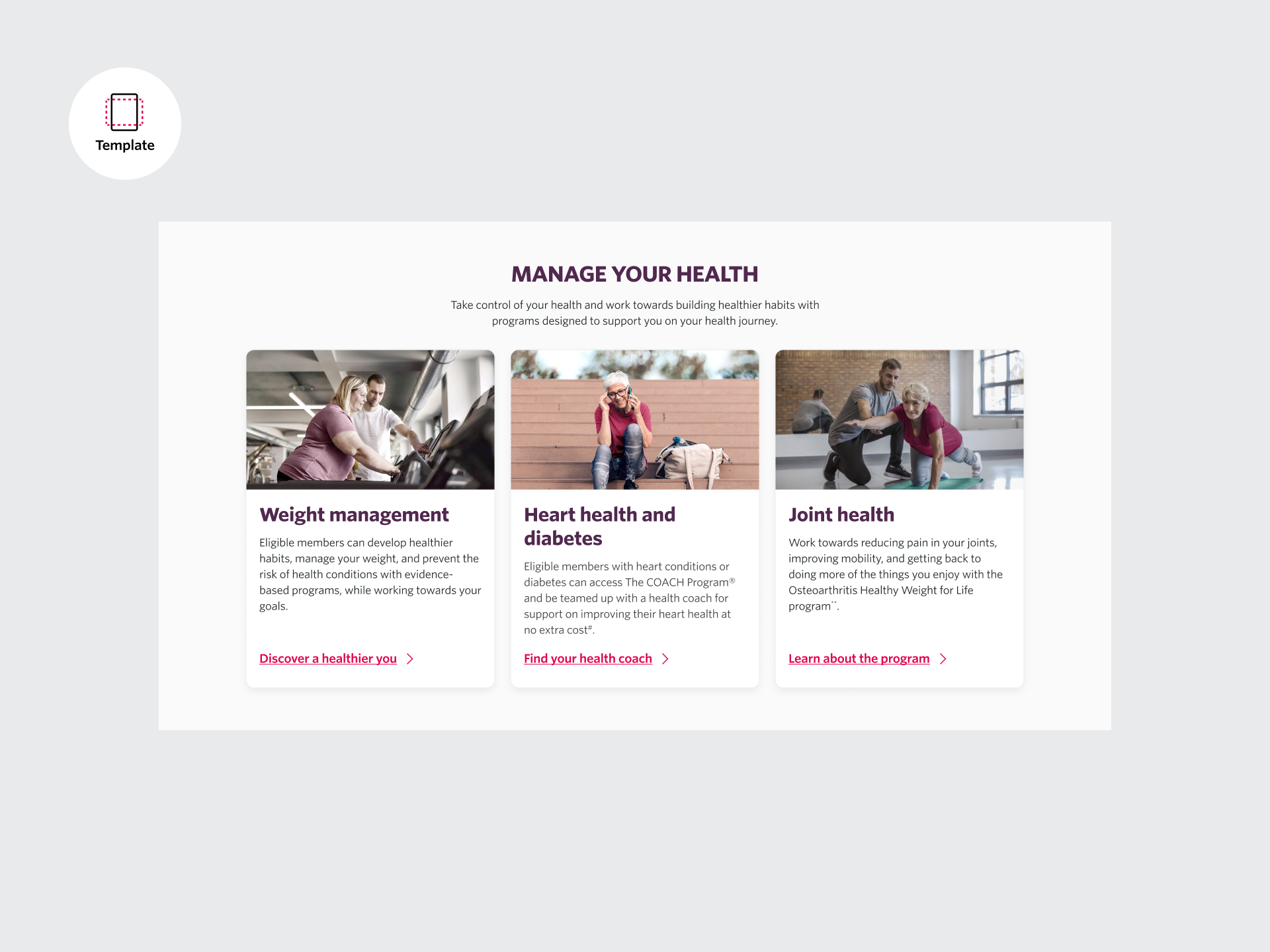
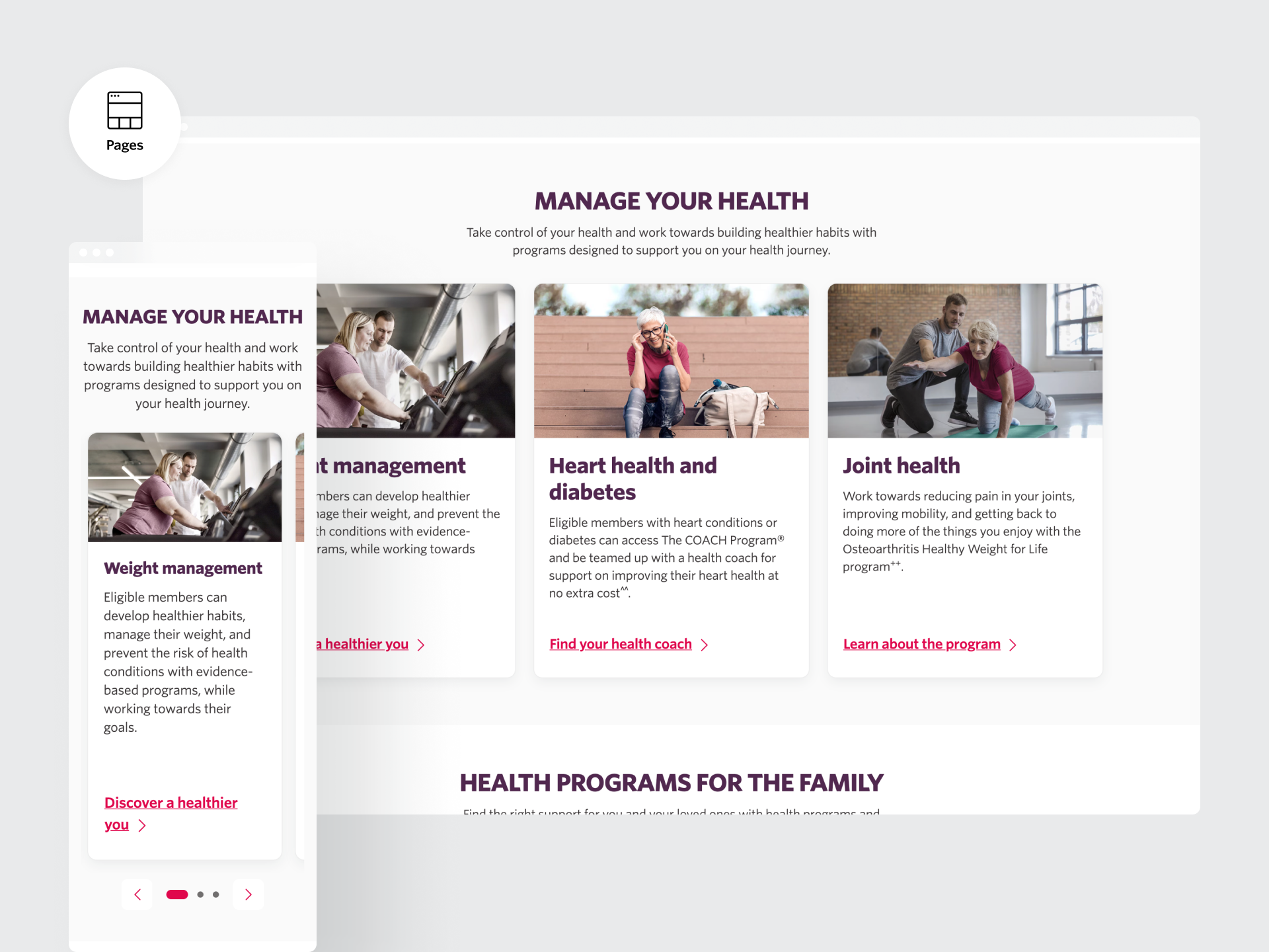
Discover
The WHAT - Insights into the Problem Space
HCF’s website was outdated, resembling a relic of the .com era. The design was overly reliant on its brand’s red and grey colors, creating a blocky, content-heavy interface that failed to meet accessibility standards. Competitor analysis revealed that brands like NIB, BUPA, and AHM had embraced modern, minimalistic designs that not only reinforced their brand identities but also delivered superior user experiences.
HCF needed to modernize its digital presence with a scalable, accessible, and future-proof design system that would elevate its website and align it with the experience offered by its updated app.
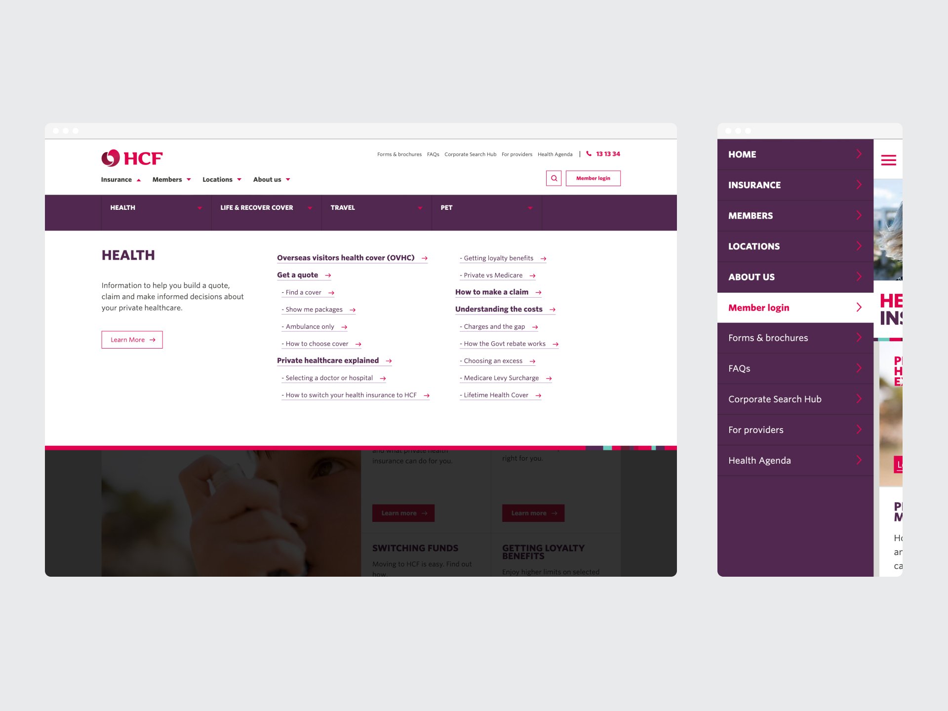
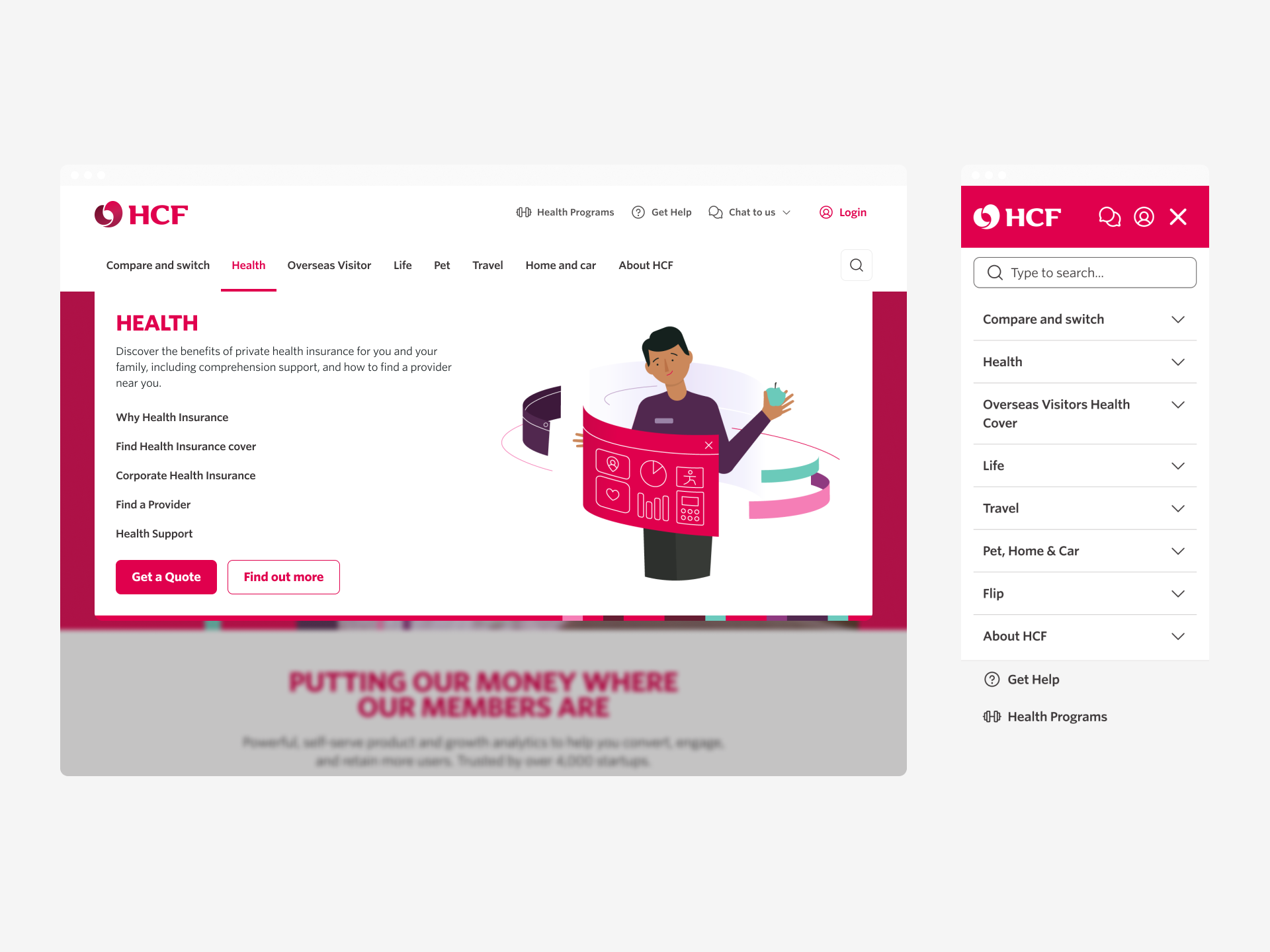
Original HCF menu and header
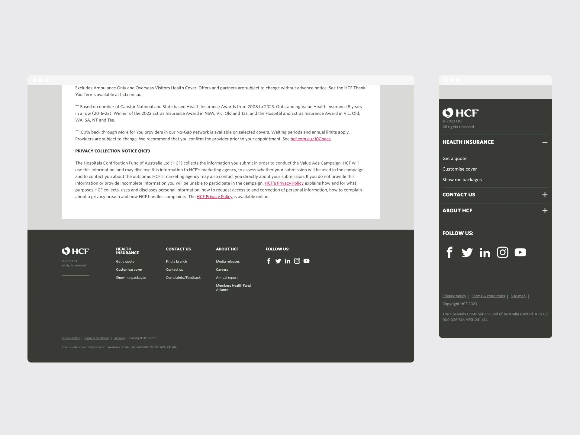
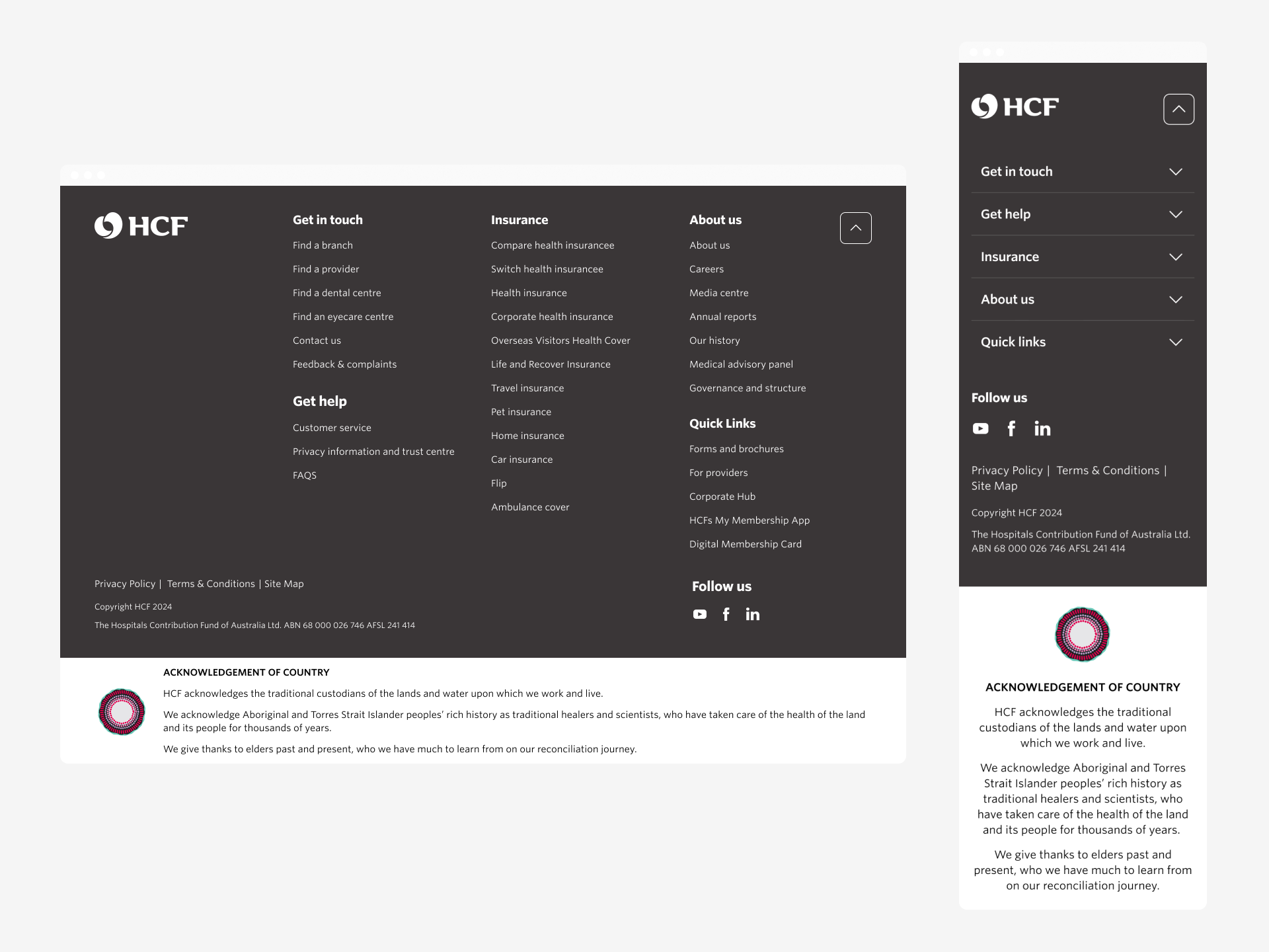
Original HCF footer
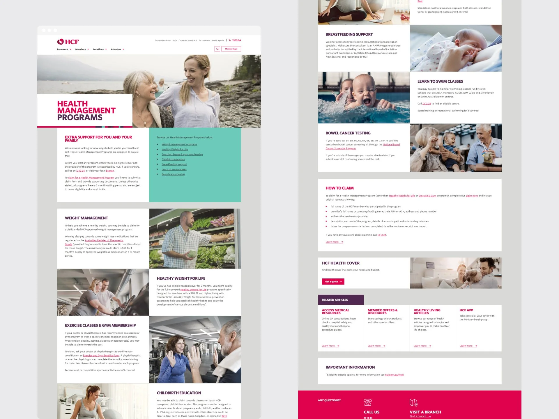
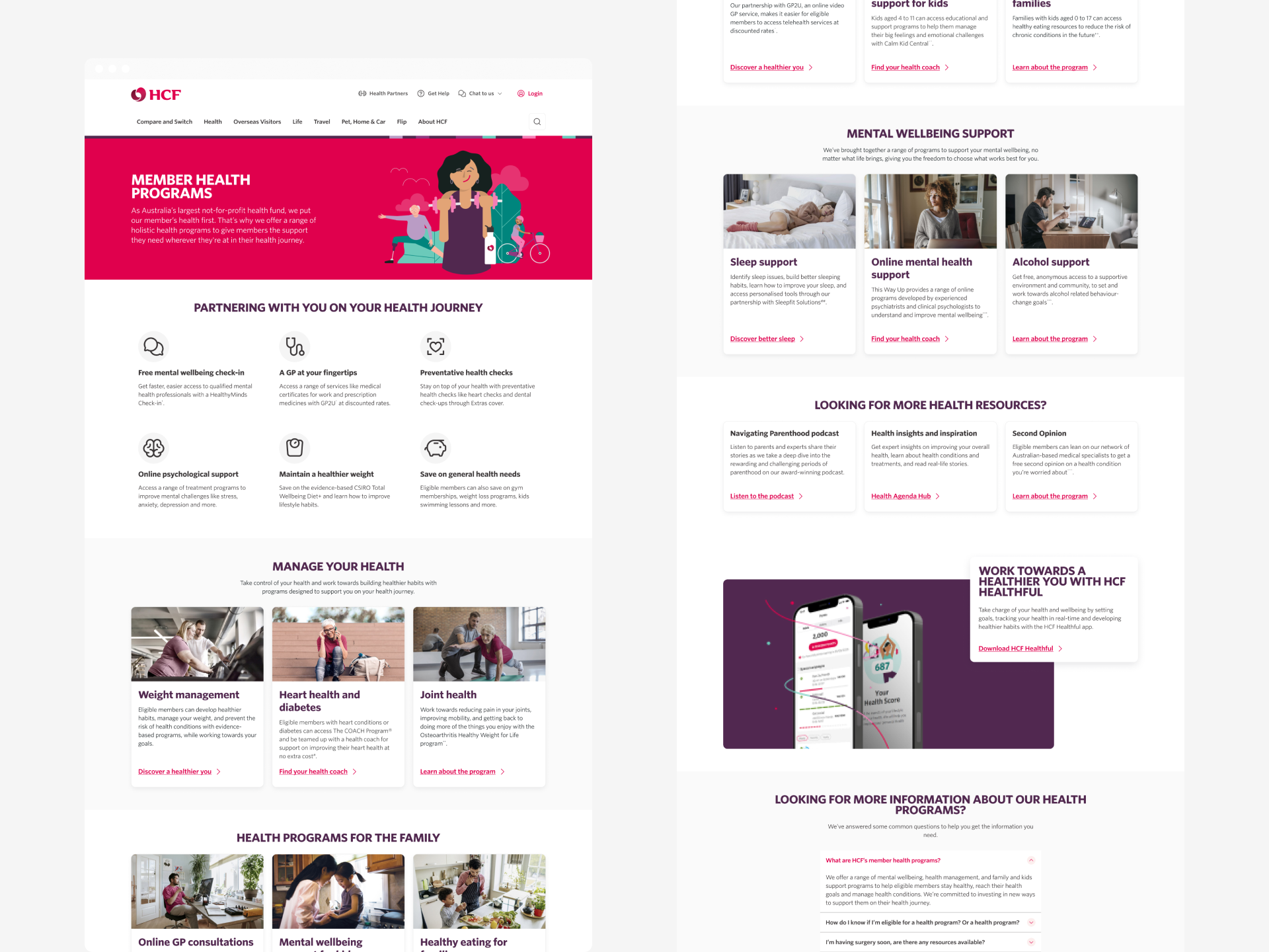
Original HCF home page
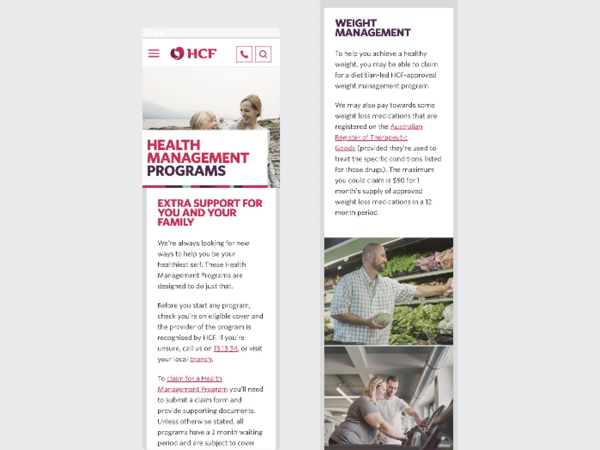
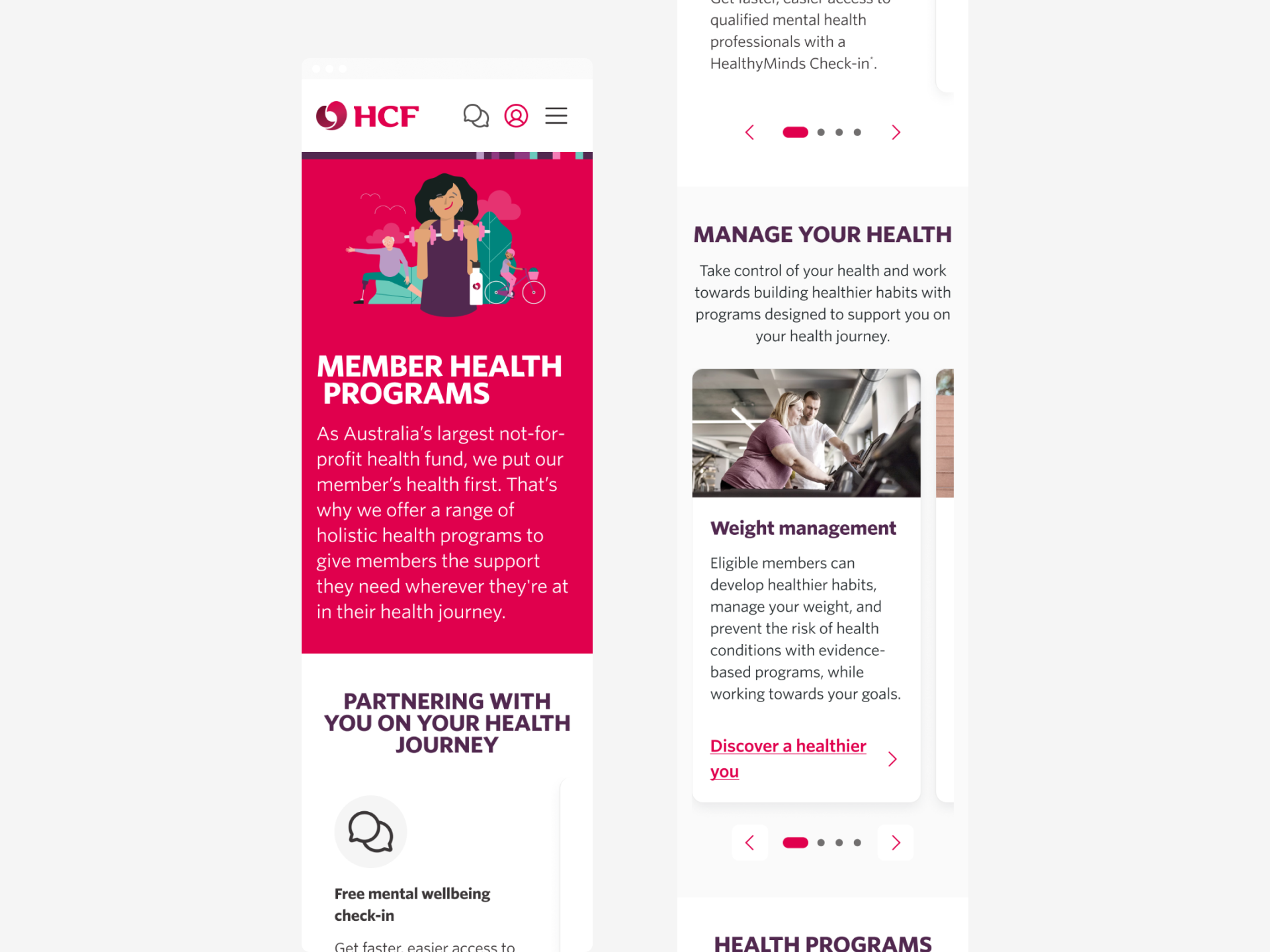
Original HCF home page mobile
Define
The Project Goal
Our mission was to build HCF’s design system of the future. Using Atomic Design principles, we aimed to create a modular, consistent, and accessible framework that would support a cohesive user experience across all platforms, while meeting WCAG AA accessibility standards.
All within a tight 3 month timeline.
-
Simplify HCF digital assets for a modern, minimalistic, and user-focused interface, reducing clutter to highlight key content. text goes here
-
Develop a new design system prioritising accessibility, raising standards from WCAG A to AA.
-
Ensure uniformity in imagery, illustrations, colours, and component variants for a cohesive brand experience.
-
Redesign layout to emphasise CTAs, forms, and value propositions, improving user engagement.
-
Streamline content to reduce cognitive load, enhancing readability and guiding users through the website effectively.
Develop
The HOW - Processes and Methods
A key strategy was redefining the use of color and space. The previous sharp-edged design felt corporate and impersonal, so we introduced softer, rounded elements to create a friendlier and more approachable interface.
The primary Ruby color—previously overused in ways that unintentionally signaled alerts—was strategically applied to high-engagement actions, such as guiding users toward the Quote funnel. This selective use strengthened its impact as a brand asset while improving visual hierarchy.
Additionally, we increased white space to enhance readability and guide users more intuitively through the site.
The Atomic steps
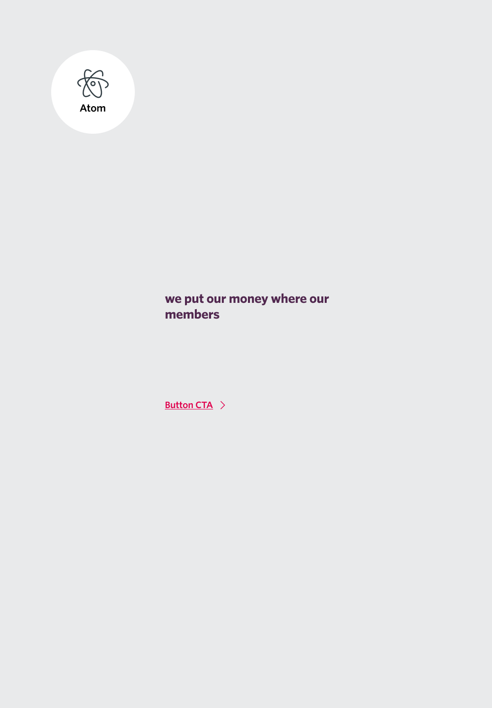
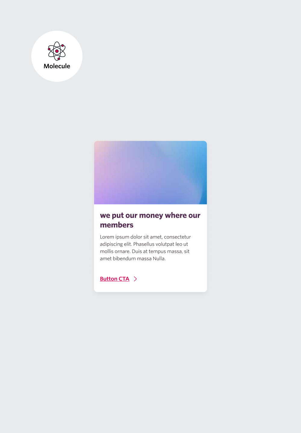
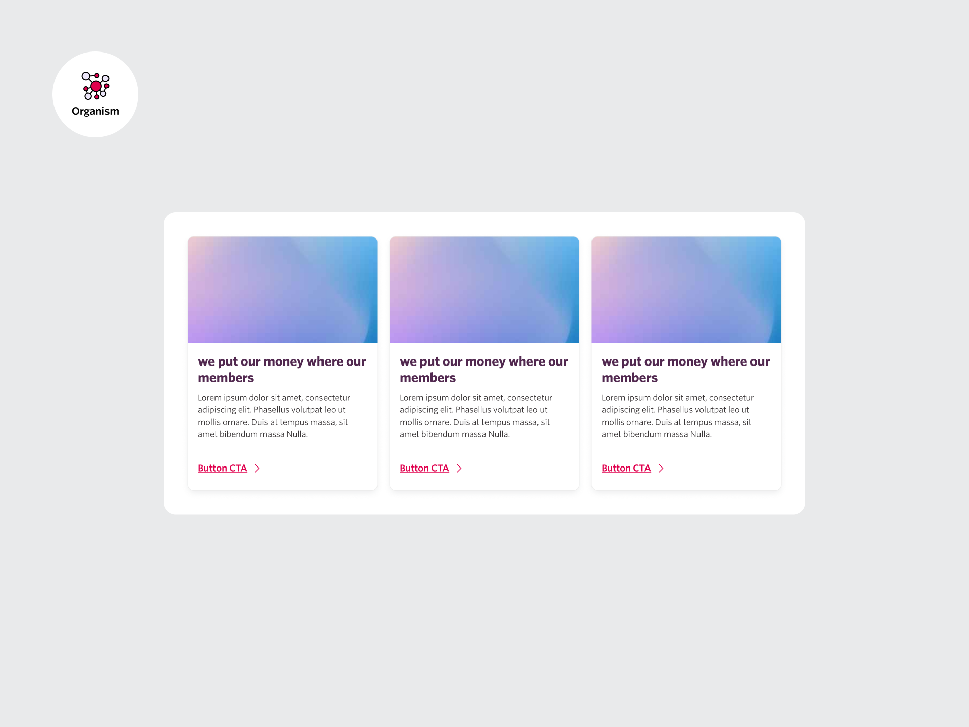
We adopted Atomic Design, breaking the system into foundational elements, simple components (atoms), combined elements (molecules), and complex structures (organisms).
Foundation
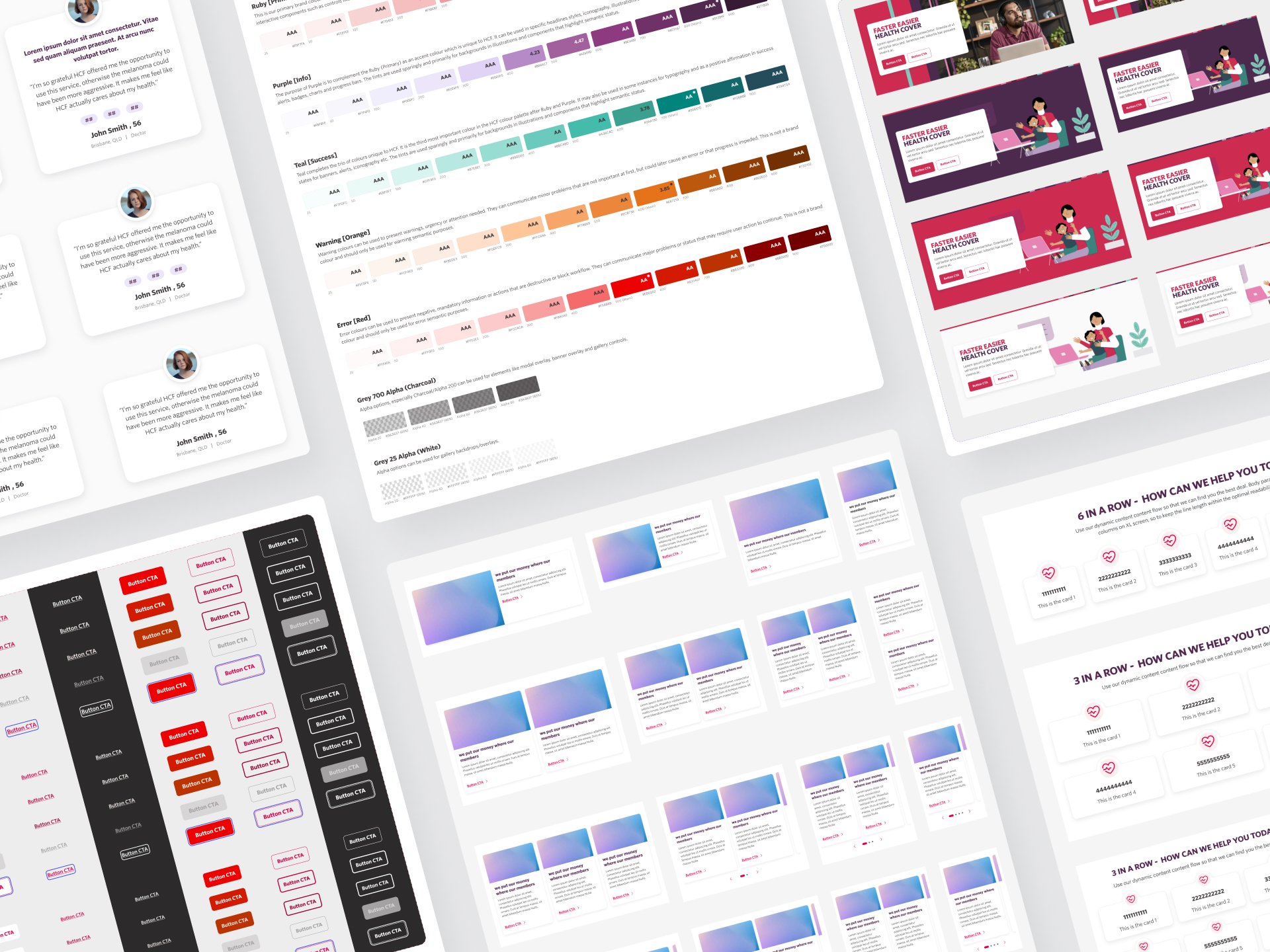
Established a strong base by defining typography, color palettes, responsive grids, shadows, spacing, and iconography.
Atoms
Built fundamental components like buttons, badges, and form labels.
Molecules
Progressed to combined elements, including checkboxes, dropdowns, accordions, and callouts.
Organisms
Developed complex UI elements, such as cards, promotional banners, panels, headers, and footers.
Furthermore, ensure seamless implementation, we leveraged advanced Figma tools like auto-layout, tokenization, and strict spacing semantics.
An Agile Approach
The project was structured into two-week sprints, with clearly defined tickets assigned to team members. Completed tasks were seamlessly transitioned to developers for implementation. Each component was meticulously reviewed for pixel perfection and adherence to WCAG AA standards before handoff.
Collaboration with stakeholders, including Brand, Product Owners, and SMEs, was integral. Regular workshops and fortnightly sprints ensured alignment and iterative progress.
Documentation and Accessibility
Detailed documentation was created for each component, ensuring clarity for developers and other stakeholders, this included component usage, limitations, rules, and interaction guides. Accessibility standards were prioritised at every stage, with all components meeting at least WCAG AA requirements.
Delivery
The WHY – Outcomes and Impact
The new design system was designed to:
-
The system aligned HCF’s website with its updated app and ensured scalability for future updates.
-
By meeting WCAG AA standards, the system improved usability for all users, particularly those with disabilities.
-
Modular components reduced redundancy and streamlined the development process.
-
The cohesive design strengthened HCF’s digital presence, making it competitive with other industry leaders.
The Result
In just three months, we delivered 12 templates covering 32 pages, alongside a foundational design system with modular components adhering to WCAG AA standards. This system modernized HCF’s digital experience, ensuring consistency across platforms like the website and app while setting the stage for future innovation.
As a critical facet of the first phase of a major transformation, the design system streamlined development and improved accessibility. Our meticulous documentation—including CSS for seamless developer handover—ensured a pixel-perfect, scalable, and development-friendly solution. Despite tight timelines, the project was highly praised for its impact and efficien