

Westpac Mobile App
A UXUI redesign | A personal case study.

A a westpac mobile and banking user, I took it upon myself to conduct a UX case study onto the Westpac mobile app. This case study was done prior to the November 2021 app redesign by Westpac.
My Role: UX, UI
Project Type: Mobile
Tools: Figma, Slack, Trello, Miro, Balsamiq, +

The Why
I chose to conduct a case study on the Westpac mobile app, as I am a regular user and have had a variety of frustrating experiences with the app. Throughout my time with Westpac, the mobile app had lacked in comparison to other banks, such as CBA.
On top of the app itself, I found a large number of my friends, and younger people, in general, have unhealthy financial habits and can’t manage their finances or meet specific financial goals.
So I decided to take action!
Whatever it is, the way you tell your story online can make all the difference.
Discover
Insights into the Problem Space
To delve deeper into my case study and create structure, I developed a project scope. From there i proceeded to conduct a variety of primary and secondary research, which then led to the development of my problem statement.

Project Scope
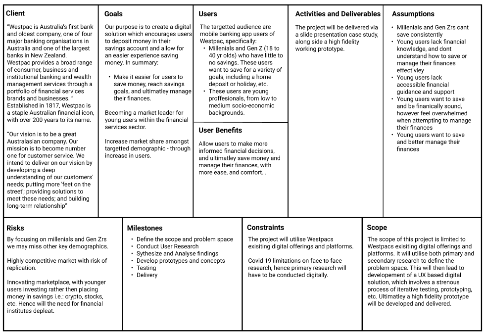
To provide myself structure and conduct this case study as thoroughly as possible, I developed a problem scope. This helped identify and understand the businesses goals and requirements and overall scope.
Research Insights
-
Competitor analysis and SWOT analysis were conducted to explore current offerings, trends, market opportunities.
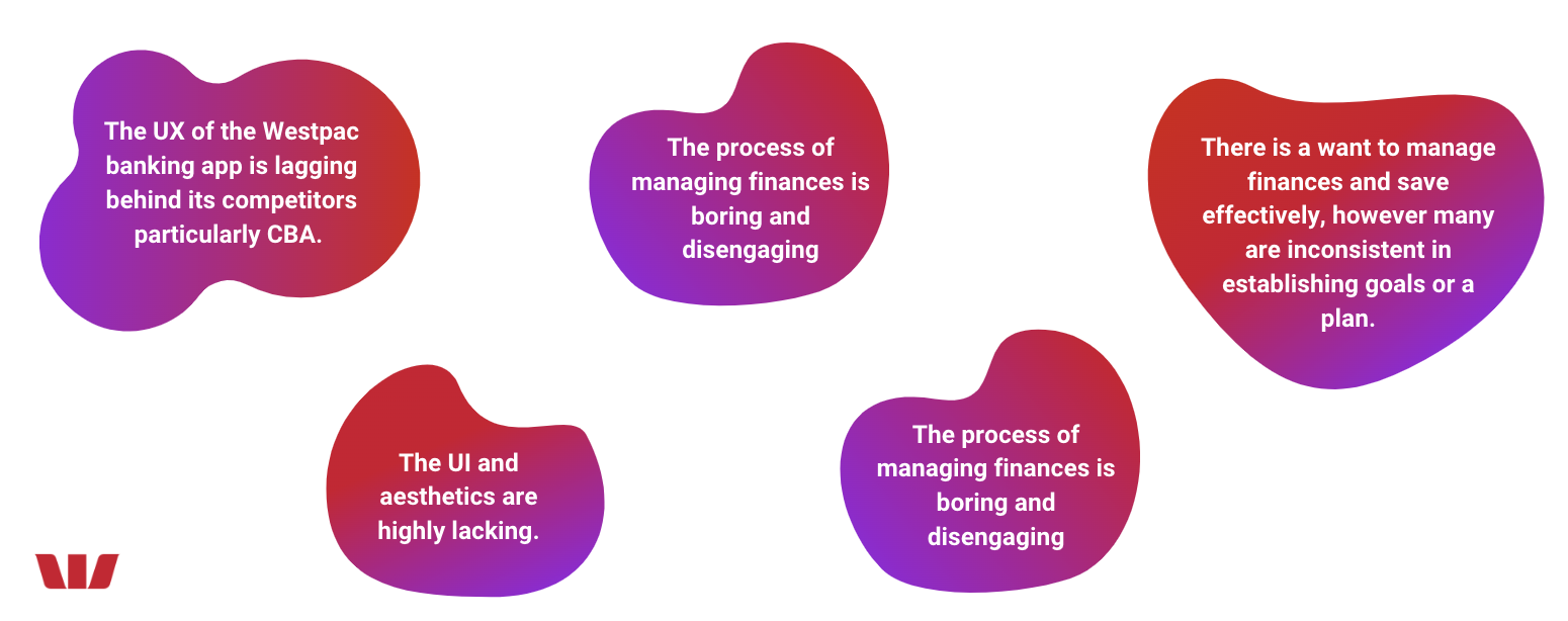
Key findings highlighted that the Westpac banking app lacked in both UX, UI, and overall functionality in comparison to direct customers such as CBA. Westpac’s app looks bland, and lacks character in comparison to more colourful competitors i.e.: CBA, Bankwest, etc. This reiterates the sterile associations of banking and the financial industry.
The banking app lacks functionality in comparison to competitors, with limited features. Specifically no spendings tracker, no spending or credit notifications. These features are already offered on a variety of competitors platforms.
Summary
Lacking visual aesthetic
Busy UI
Lacking UX
Lack of functionality
-
User research was paramount within this project, however, due to Covid 19 restrictions face to face interaction was limited. Hence a variety of digital methodologies were implemented this included a heuristic evaluation, 1:1 interviews, and a survey. Summary of the interviews are as followed.
All participants utilised mobile banking and were Gen Z or Millennial.
Though financial literacy and security varied amongst the participants, a constant pain point illustrated amongst a majority - was managing expenses and curating finances. Many managed their finances casually, however would like a tangible method or process to assist them on their journey.
-
A survey was conducted to supplement the interviews conducted.
Participants included Millennial and Gen Z individuals, with varying financial habits.
Key insights highlighted their finances are highly important to them, their finances make them feel both happy yet overwhelmed, and a majority of participants have a casual savings plan - however, they inconsistently follow them.
Problem Statement
Young working Australians feel overwhelmed when managing their finance, they want to save money and reach saving goals, but have no easy to access support or guidance when making financial decisions.
Define
Sythesize research to develop insights and define the problem space
To synthesise the research gathered, my team and I utilised various design thinking methodologies to refine our insights and find themes within our research. These findings then allowed us to empathise with the users and further identify their pain points and areas of opportunities for CharityBay.

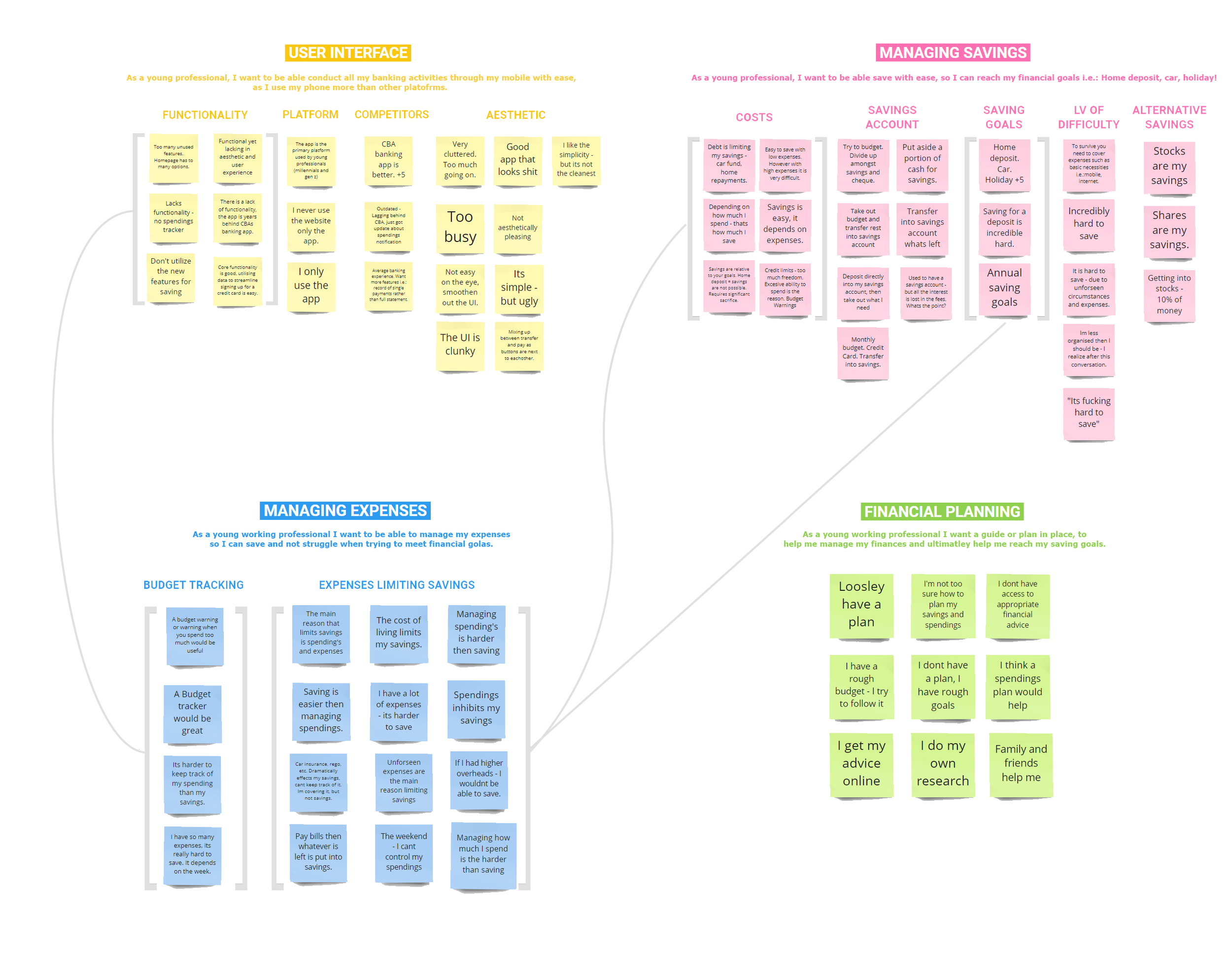
Affinity Mapping
Through synthesising the research gathered, I developed an affinity map utilising an open sorting method.
This led to four overarching themes emerging:
User Interface
Managing Savings
Managing Expenses
Financial Planning.
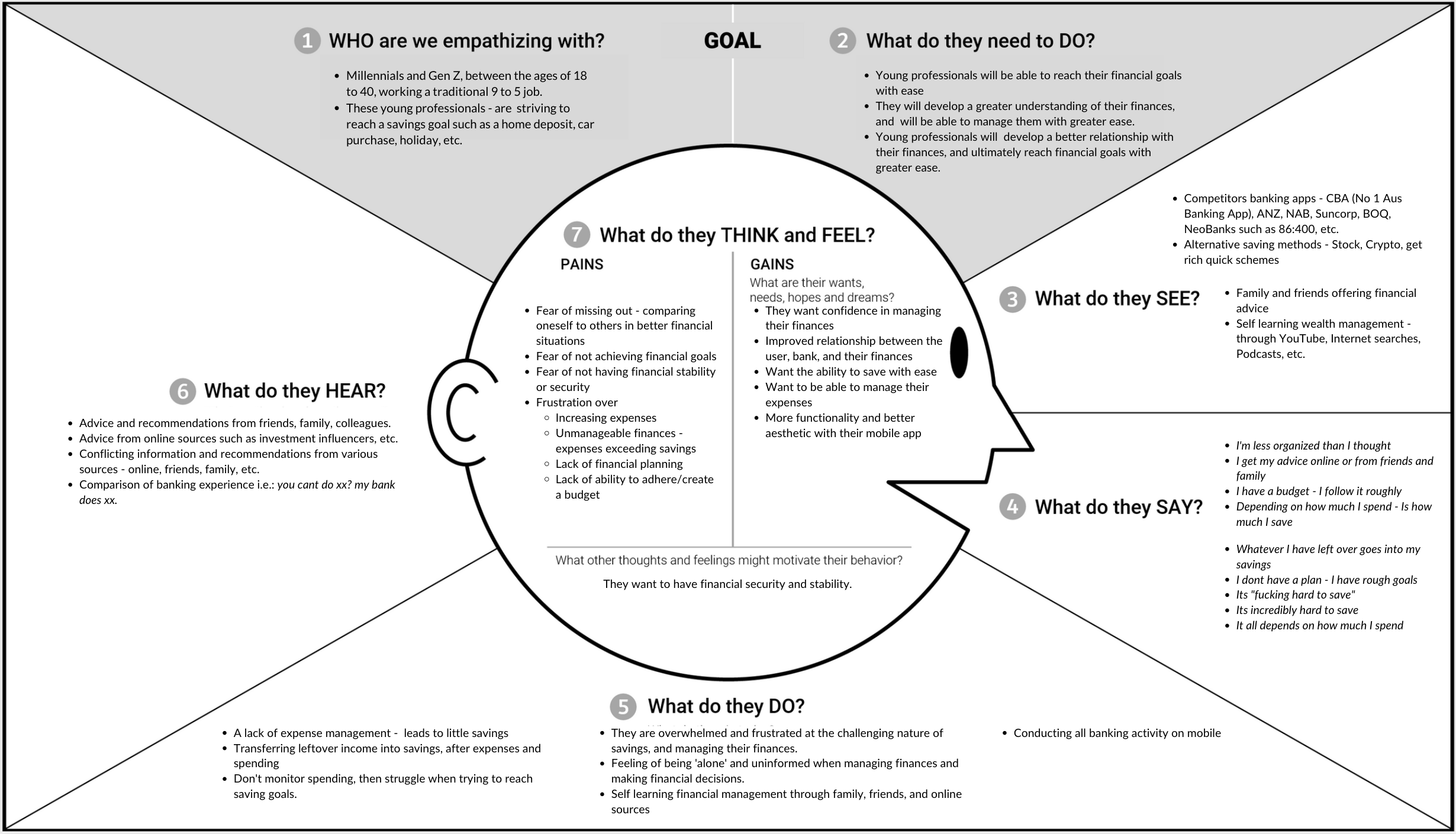
Empathy Mapping
To gain a deeper understanding of the user, an empathy map was developed with insights sourced from the affinity map. This map allowed us to gain an insight into the end-user experience by highlighting what they think/feel/see/hear/do when interacting with their Westpac mobile app.
Key Insights
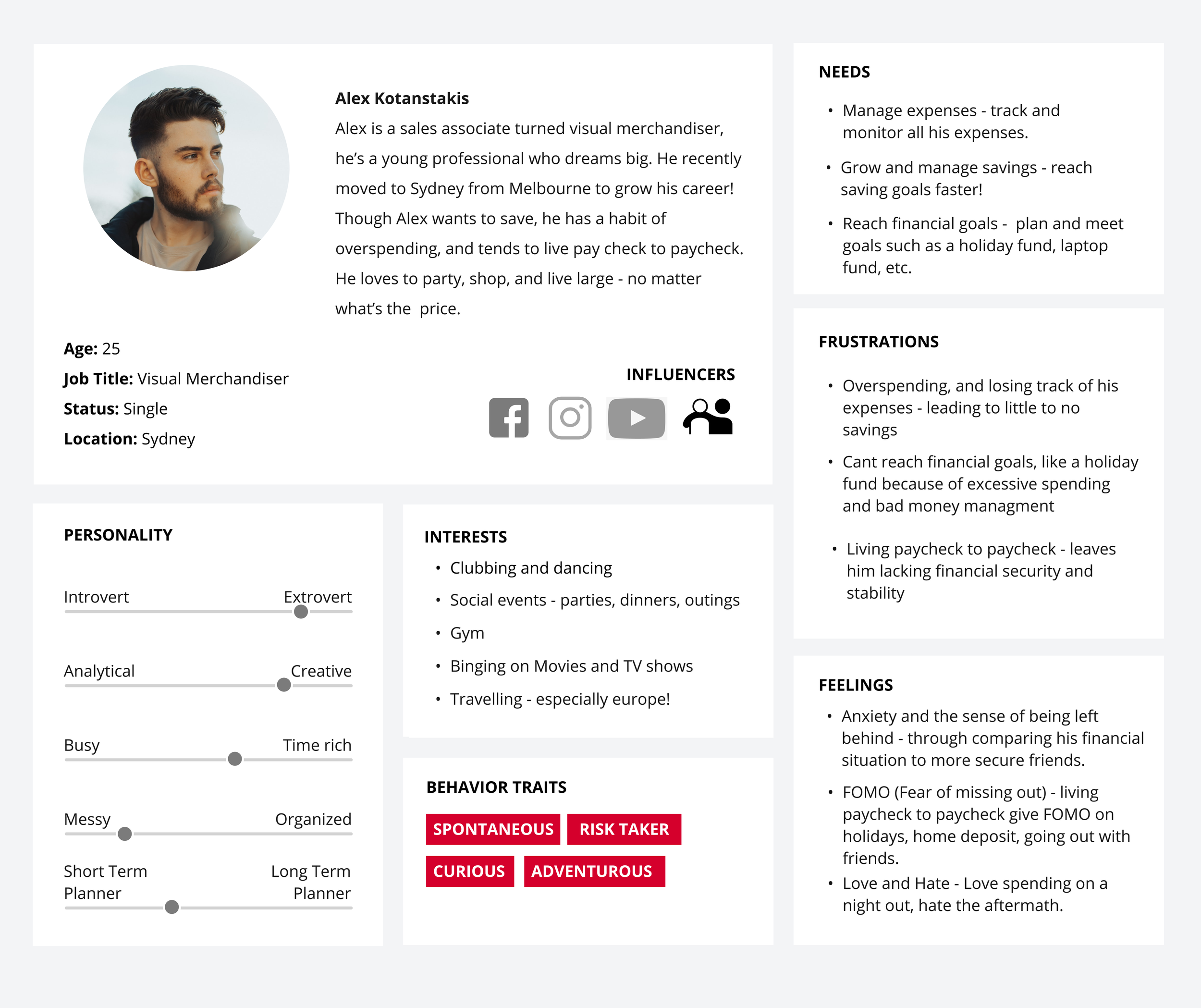
Hello Hero! Meet Alex
Three distinct personas were developed based on the research conducted. Alex was selected as the hero persona as his desires, product usage, and background aligns with the project brief and problem statement.
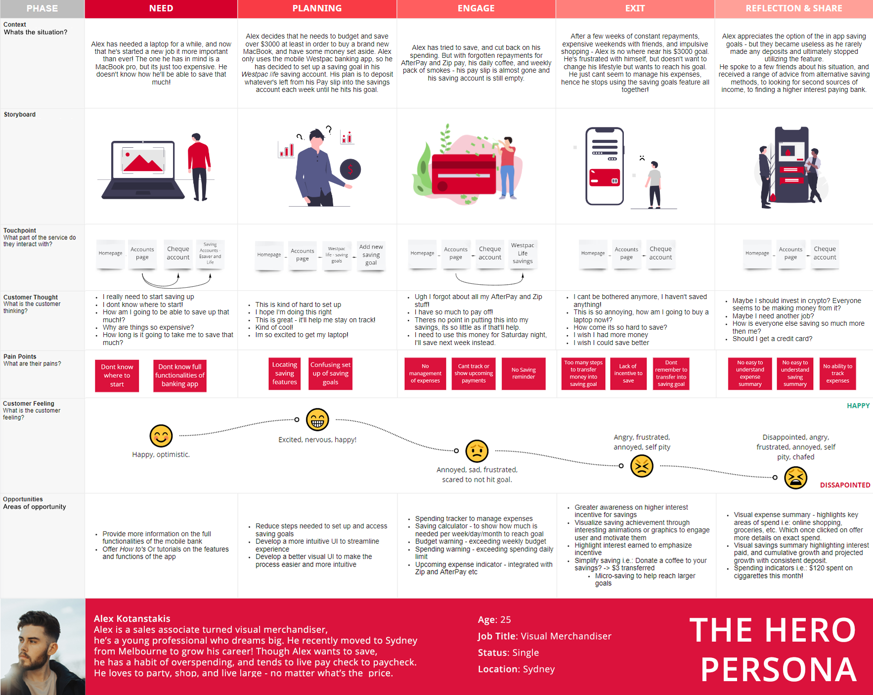
Customer Journey
A customer journey map was created to follow Alex's experience with the Westpac Mobile banking app and the banking process, highlighting the pain and plus points of his journey.
Develop
Ideating solutions through an iterative approach
Utilising a variety of HCD methodologies and design thinking tools, this phase encouraged divergent thinking to ideate creative solutions to the issues and pain points uncovered.

How Might We | HMW
To reframe the design problem into an actionable opportunity a How Might We statement was developed. Several HMW statements were created, however, the primary ones are highlighted below.
How Might We enable young professionals to manage their finances and build wealth?
How Might We improve the financial management experience on mobile?
How Might We improve the financial management experience on mobile?
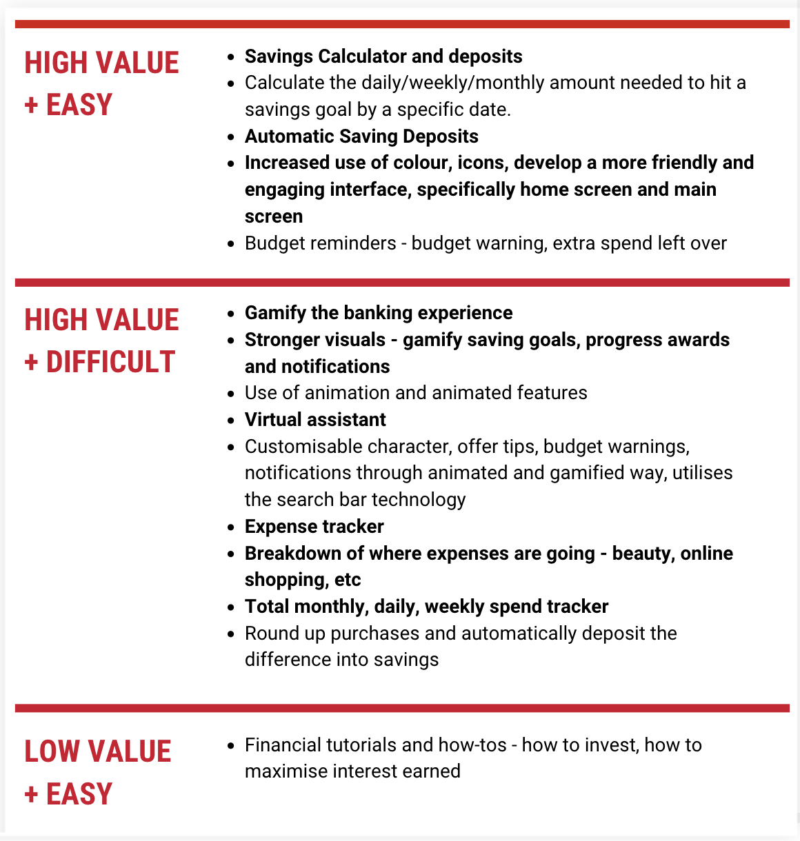
Ideation
My favourite aspect of the design process is ideation, as I get an opportunity to foster innovation and cultivate creative ideas in volume! Ideation was personally my favourite aspect of this project. A variety of ideation methodologies were implemented to explore the HMW statement effectively, these included the Crazy 8 methodology and Storyboarding, ultimately leading towards the MVP.


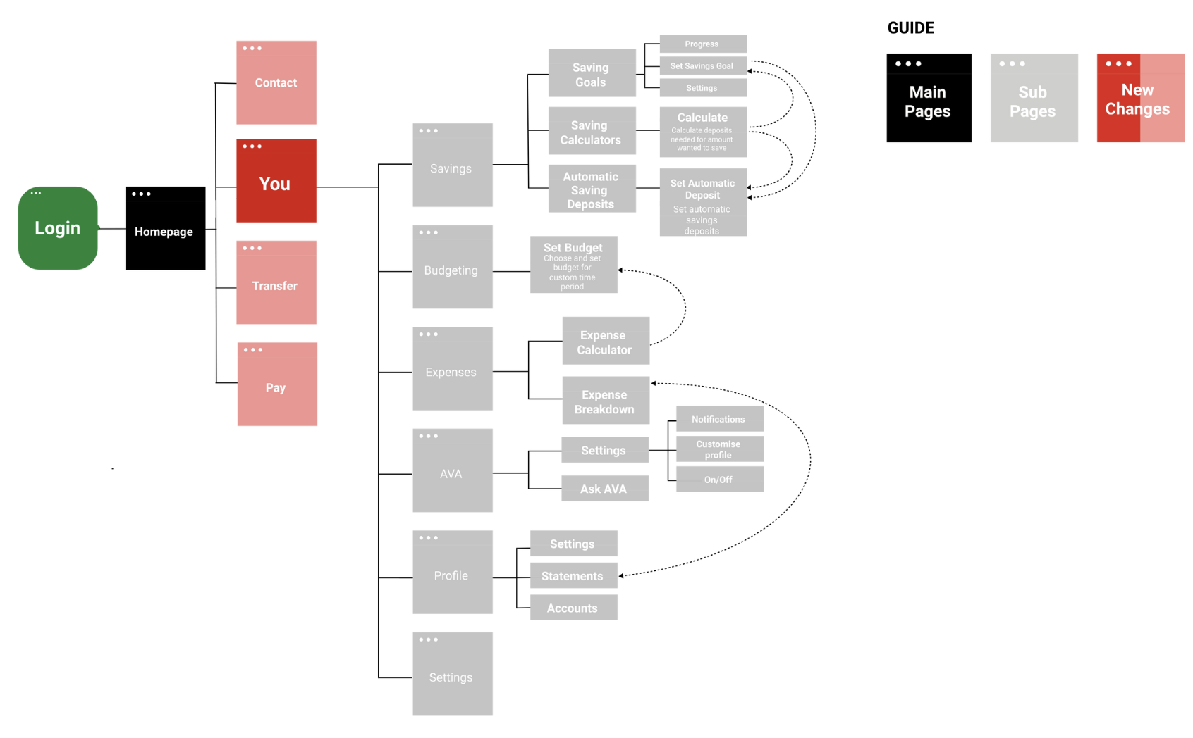
Card Sorting. Information Architecture. User Flow.
Card sorting was implemented to develop the information architecture of the app. The information architecture drew from the open card sorting method, which then developed the skeleton for the end-user flow.


Minimum Viable Product
-
Visualise impact of contribution through visual examples i.e.: one-week groceries
-
When listing a product, other suggested listings will pop up to assist in pricing & writing description
-
To communicate a modern, contemporary, e-commerce with a purpose look - CharityBay will get a UI refresh
Wireframes and Sketches

Due to the breadth and details of the wireframes, only a sample can be included in this presentation. Rough wireframes were sketched up, then further developed on Figma. The wireframes were kept minimal, serving as a low fidelity foundation for the final prototype.
User Interface
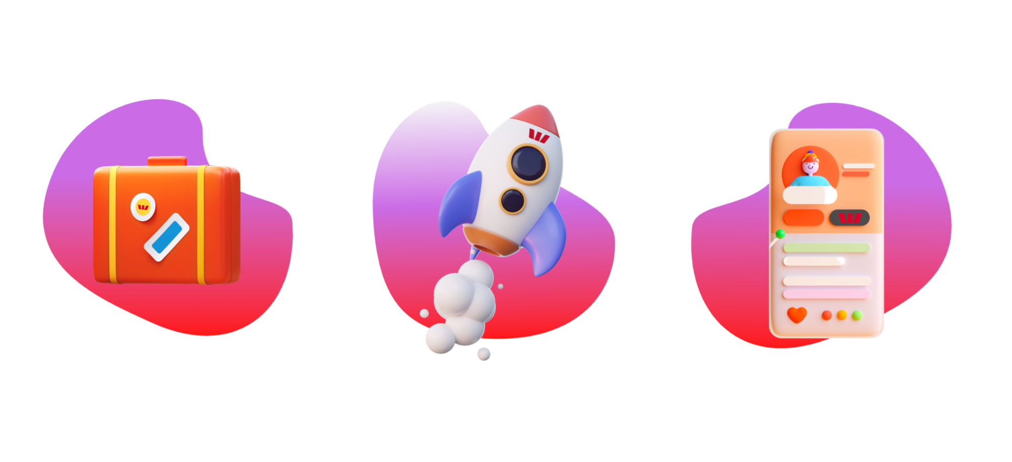
To ensure the new Westpac YOU feature maintained brand integrity and seamlessly blended with Westpac's existing offers and products, their corporate brand guideline was utilised - with brand colours and fonts remaining compliant. However, to offer a visually stimulating and engaging experience, with a 'gamified' notion and feel, 3D elements such as characters, and visual goal trackers, etc, were added.
Delivery
Building and testing solutions within the implementation phase
Within the delivery phase, my team an I cycled through phases of rapid iteration, usability testing, and design reiteration - leading towards our final design and product.

LO-FI Prototypes
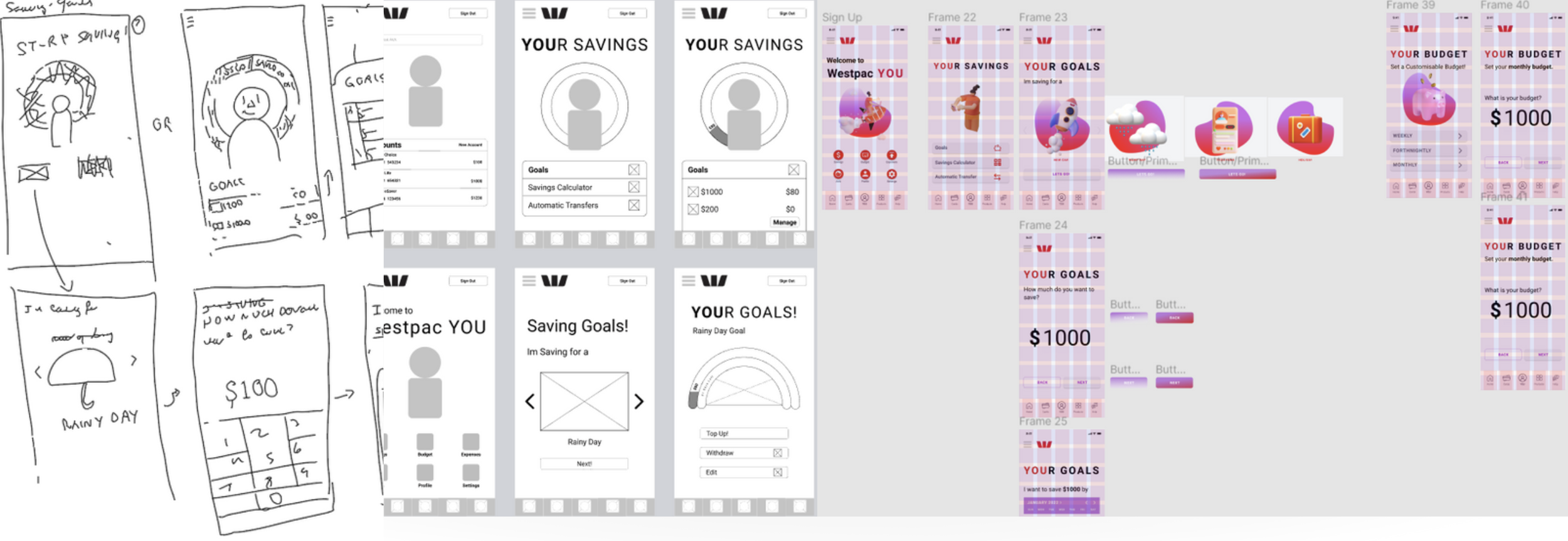
The wireframes developed from the rough sketches then serve as a basic lo-fi prototype, which was then further refined on Figma once again. These wireframes developed the foundation for the final prototype, serving as an interlude between the testing and development and ultimately the final product.
Usability Planning & Testing
The low fidelity app was tested by three participants, the app was then retested once again with the revised high fidelity prototype.
Three participants tested the prototype, two were conducted remotely and one was conducted face to face. The testing led to several changes, as I took on board feedback and revised the final product to ensure all pain points were alleviated.
Due to Covid 19 restrictions, in person testing was limited.
Key Insights
Adjust writing to align with the image when selecting a goal
Make end image once the task is complete more engaging and full
Liked the use of 3D elements - felt it was more engaging
Liked saving goals for functionality and visual elements
Likes the increased use of colour
Likes 3D elements
Wanted the end screen for goal setting to have a more engaging image/achievement badge.


FIGMA Process
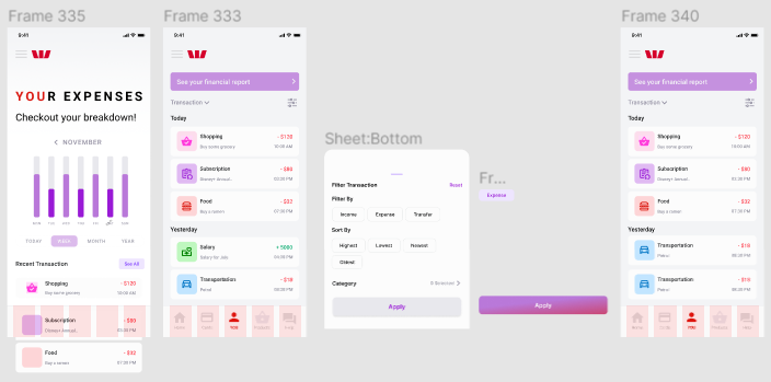
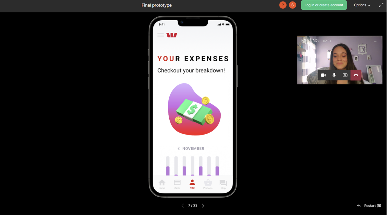
The final prototype was developed on Figma, with a variety of revisions and tweaks added Westpac YOU had developed from early sketches to high fidelity working prototype, entirely on Figma. The Art-board below highlights a slice into the process of creating this prototype, I have strived to maintain a clear and curated board although it may be challenging at times due to the size of this project.
The Result
The design overhaul of the banking app aimed to transform the user experience by introducing gamification elements to make banking more engaging and rewarding. The redesign prioritized simplifying the saving process, enabling users to achieve their financial goals effortlessly. By reducing cognitive load, the app ensures users can navigate and interact with its features seamlessly, minimizing confusion and maximizing efficiency. Additionally, the UI was streamlined and elevated with a modern, visually appealing aesthetic, creating a cohesive and intuitive interface that enhances overall usability and satisfaction.