
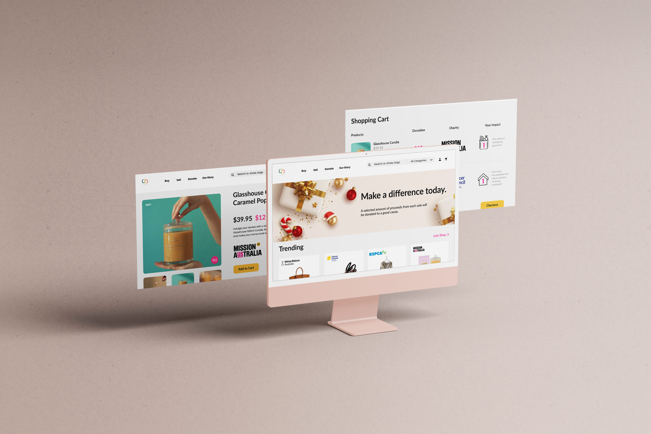
Making charity easy.
Charitybay.org
A UX and UI transformation.
Charitybay is a non-for-profit organisation, that offers a digital platform to connect sellers and buyers - however a percentage of the proceeds from each sale is donated towards a social cause of the sellers choice.
My Role: UX, UI
Project Type: Website
Tools: Figma, Slack, Trello, Miro, FigJam +
The Brief
CharityBay provided the following brief and objectives
“We want to improve the user journey of our key customers, in particular, the user journey of the buyers both for the website and mobile app, from the moment they discover us and use CharityBay, to the moment they become advocates”.
-
Increase conversions: Increase the percentage of visitors that end up buying items by having an easy discovery of items, easy interaction, precise and tactical CTAs and eliminate steps when possible.
-
Focus on Impact: We want to provide each buyer with the highest emotional reward possible when using charityBay. That they understand our value propositions and how by buying on charityBay they can continue their regular online shopping, but better as they are doing good with their purchases.
-
Advocacy: We are based on product-led growth, so our most important channel must be referrals. We want to include active CTAs within the journey for each buyer to share about charityBay, and the good they are doing by purchasing with us.
Discover
Insights into the Problem Space
To flesh out the problem space and identify the crux of the CharityBays issues - a project scope was developed, this was then followed by an array of primary and secondary research into the problem space, this developed the final problem statement.
Research Insights
-
I conducted a competitive analysis of several businesses with a similar business model as to CharityBay. The key insights that emerged highlighted CharityBay lacked within several key areas, specifically their weak UI and UX, lack of information in regards to the business offering and services, and overall lack of emphasis on the contribution made.
-
My team members and I all conducted three 1:1 interviews each, with target users the key insights are as follow.
Target users donate to causes that align with their experience.
4 out of 6 users felt unsure about charity websites as there are way too many out there.
The buyers want to have the power to decide how the money they spent on the website is spent? And to which organisation?
Users want to hear real stories from real people, to feel connected.
Users wonder why they should use this website among other charity websites?
-
My team and I designed and distributed a digital survey, the results reiterated findings from the competitor analysis and 1:1 interviews. With the findings indicating several reoccurring pain points and insights, the weak UI and UX, the lack of brand awareness, and lack of clarity on the purpose of the organisation.
Key quotes
• “A bit confused, did not realise the search button was there”.
• “It was ok, I just wasn’t sure what the site was about at the start”.
• “Fairly simple to use but I don’t like the products, not really anything I am interested in”.
Problem Statement
Conscious Consumers feel frustrated when trying to purchase ethical products due to not being able to view and understand the impact of their contributions
Define
Sythesizing research to develop insights and define the problem space
To synthesize the research gathered, my team and I employed various design thinking methodologies to distill insights and uncover patterns within the data. These processes enabled us to deeply empathize with users, identifying their key pain points and uncovering opportunities to enhance the user experience for CharityBay.
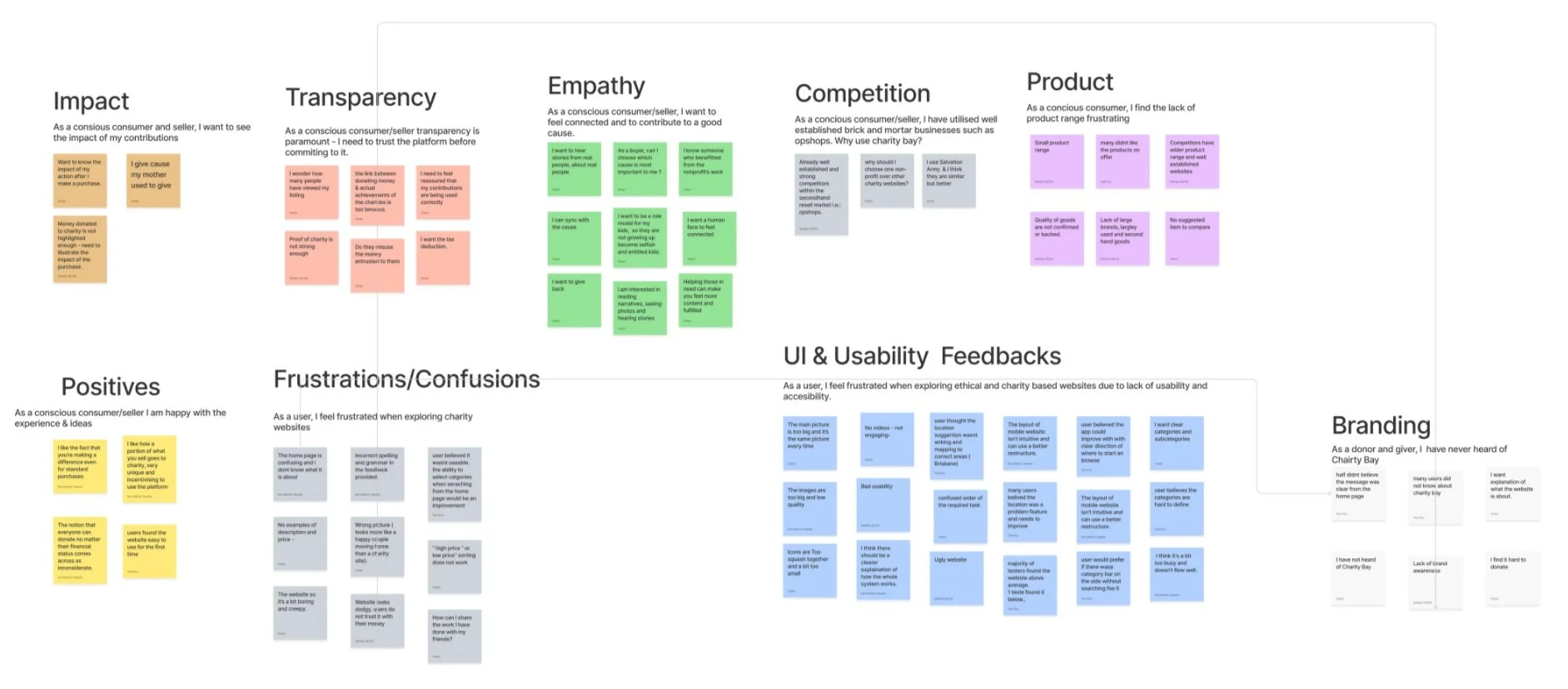
Affinity Mapping
My team and I conducted an affinity mapping session, where we analysed and synthesised our research findings into various key themes. The over arching themes that emerged reiterated a weak UX/UI, with frustration laying within the lack of understanding on CharityBays offerings and charitable contributions. Users want to contribute towards a good cause, however want transparency on where and how much money will be donated - they also want to have access to a variety of goods rather then be limited to whats available.
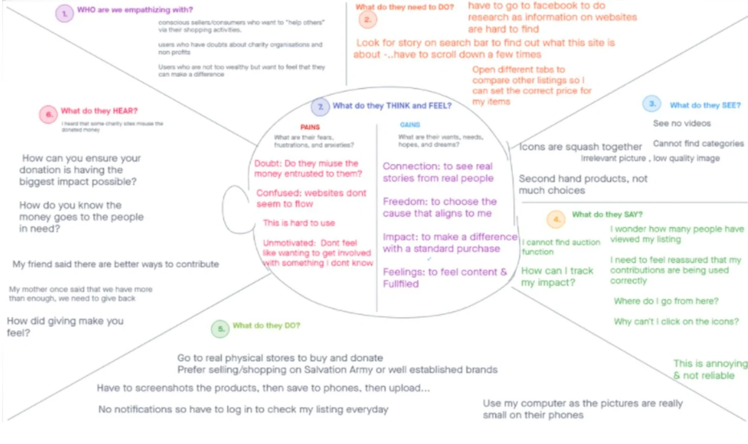
Empathy Mapping
Drawing from research insights I developed an empathy map, highlighting what an average CharityBay user thinks and feels like. This map allows my team and I to further empathise with the user and develop a persona.
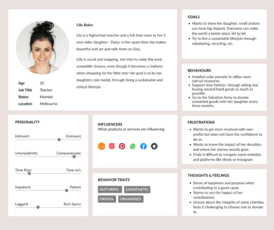
Hero Persona - Meet Lilly!
Based on our insights uncovered through the discover phase, and the traits from the empathy map - I led the development of our hero persona. Meet Lilly, she’s a young mum, who shops organic and ethically - whenever she can. She strives to make the world a better place for her little girl, through any little step she can - from recycling bottles to having their own veggie patch, Lilly is proud to be a conscious consumer.
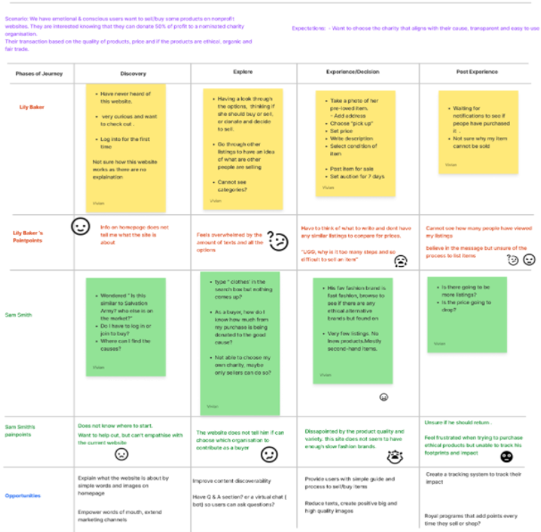
Customer Journey
My team and I developed a customer journey map to identify the pain and plus points of her journey when trying to utilise charity bay. This map clarifies the areas of opportunity CharityBay holds and guides us towards creating a solution.
Develop
Ideating solutions through an iterative approach
Utilising a variety of HCD methodologies and design thinking tools, this phase encouraged divergent thinking to ideate creative solutions to the issues and pain points uncovered.
How Might We | HMW
To reframe the design problem into an actionable opportunity a How Might We statement was developed. Several HMW statements were created, however, the primary ones are highlighted below.
HMW builds trust among users so they choose Charity Bay as a preferred source of non-profit?
HMW offer users transparency and meaningful experience via our website?
HMW engages users & highlights the impact users have on society when contributing towards charity?
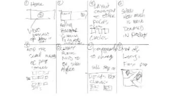
Ideation
Ideation was personally my favourite aspect of this project. My team and I utilised design thinking tools and methodologies to generate a volume of creative and blue sky ideas and solutions. Methods used included Crazy 8s, Storyboarding, Concept Cards, and more - these techniques led to the development of the MVPs.


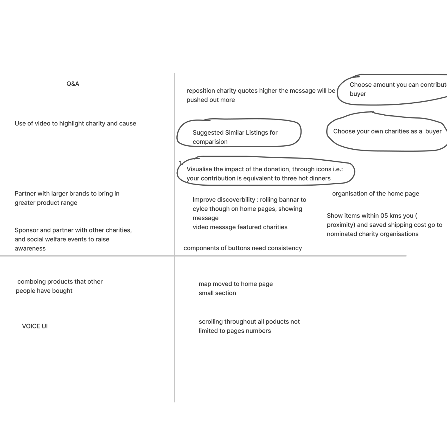
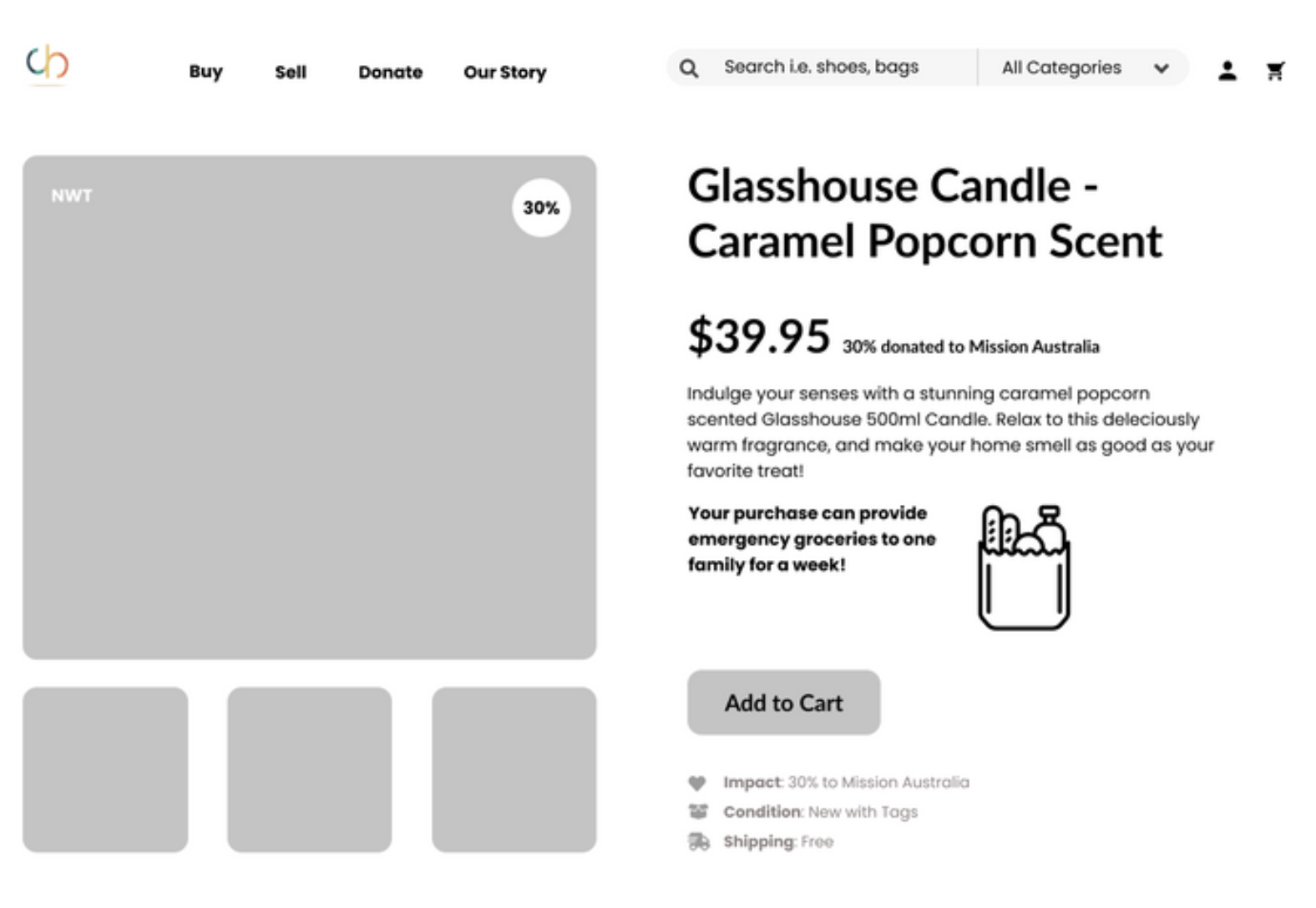
Minimum Viable Product
-
Visualise impact of contribution through visual examples i.e.: one-week groceries
-
When listing a product, other suggested listings will pop up to assist in pricing & writing description
-
To communicate a modern, contemporary, e-commerce with a purpose look - CharityBay will get a UI refresh
-
Buyers can choose the amount donated, and to which organisation
Information Architecture
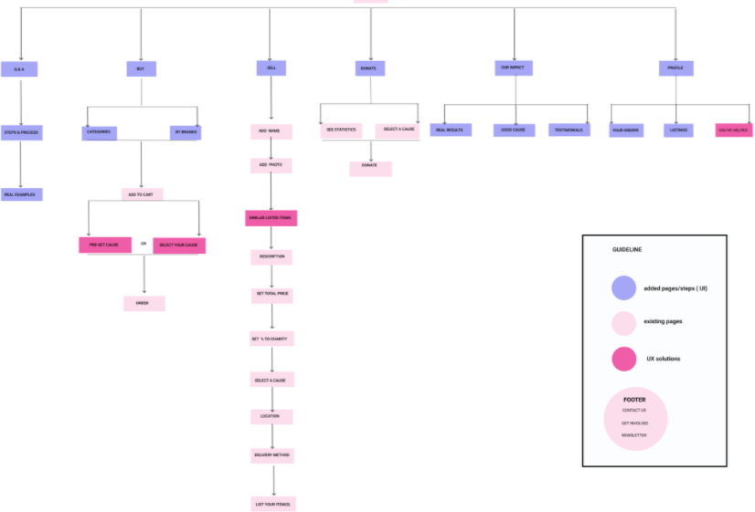
My team and I then developed an information architecture including the new pages we added as a part of our solution. This allowed stakeholders to visualise the entire site and where our solutions - specifically IT.
Wireframes and Sketches
My team and I divided the new and exisiting pages which were part of our solution. We proceeded ideate our solutions through basic sketches. Personally this process allowed me to ideate a volume of creative solutions with ease, and ultimately develop the foundation of the final design and prototype.
Deliver
Building and testing solutions within the implementation phase
Within the delivery phase, my team an I cycled through phases of rapid iteration, usability testing, and design reiteration - leading towards our final design and product.
LO-FI Prototypes
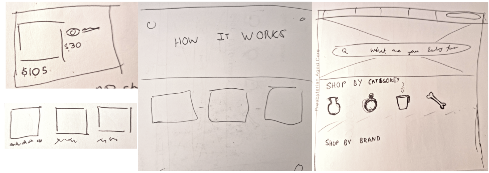
The final phase of this project was to bring my team and I solutions to life. I started developing a lo-fi prototype from the foundation established from the sketches and wire-framing conducted prior.
As highlighted in the image, I converted initial sketches into a bare-bone lo-fi prototype - which then was used within usability testing.
Usability Planning & Testing
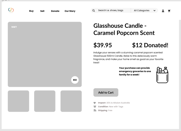
My colleague led the usability planning documents, which was then used throughout our team whilst conducting usability testing. The findings of my testing concluded that amount donated from the purchase should be further emphasised, adding a visualisation of the amount donated and its impact allows the users to further understand the impact of their purchase. Small details such as placing the donation amount at the bottom right rather then top right reduces confusion on whether the item is on sale or if that is the donation amount.
Ultimately through an iterative process of user testing I was confident the final prototype will offer the most intuitive and positive experience for the users.
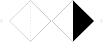
The Result
Our UI and UX transformation was developed through a strenuous and iterative process involving extensive research both primary and secondary, ideation, and more. We followed the double diamond framework to encourage and foster creative, divergent, and blue sky thinking to resolve the problem space and address the pain points we had uncovered in a creative and effective manner.